Adding Cashback Without Breaking the Funnel
The browser's load time — a moment nobody owned — became the answer to a $140M confidence problem.
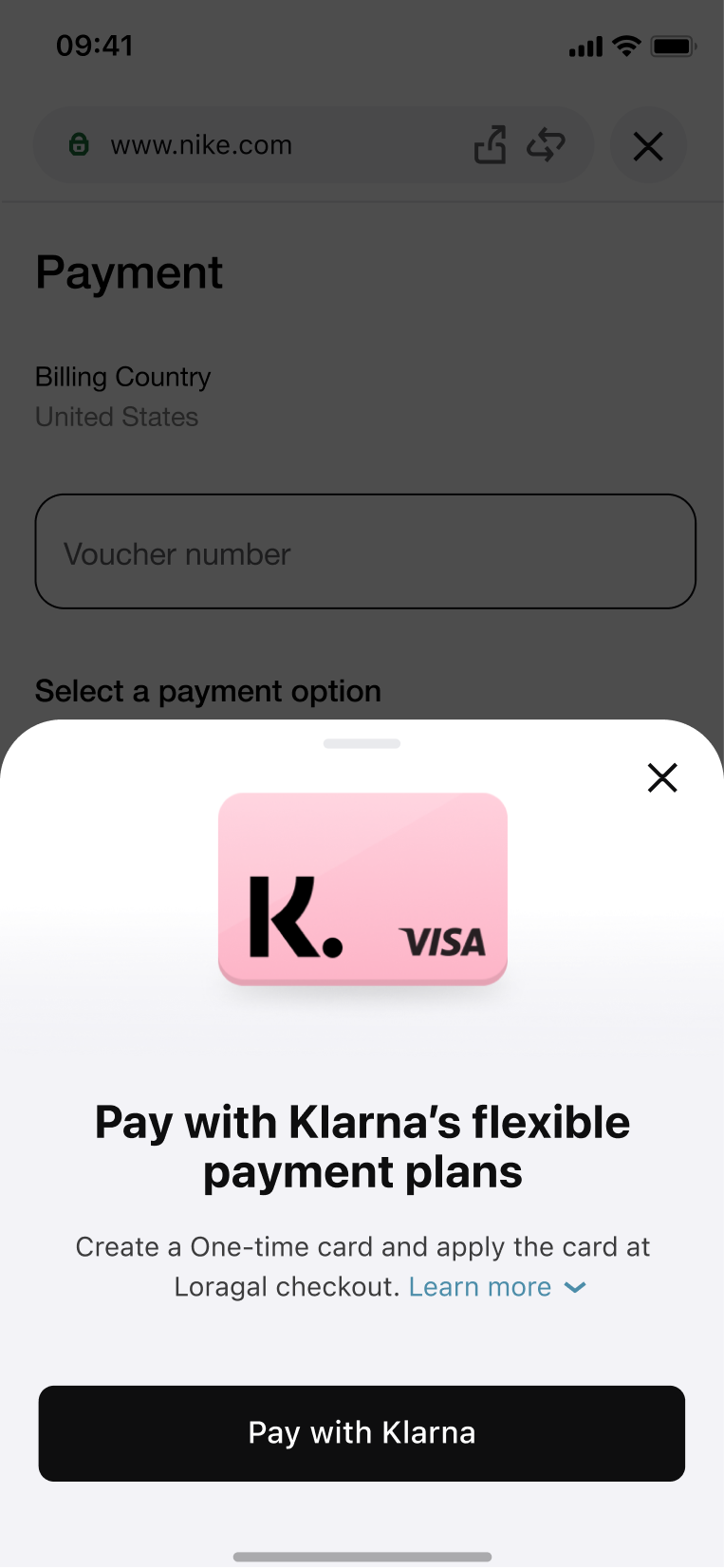
Klarna's in-app browser had a high-performing revenue flow in the One-Time Card. The brief: introduce Cashback without hurting OTC. Adding friction to tell users about cashback risked killing the flow that funded everything. The answer was borrowing the browser's load time — a full-screen splash that disappeared before it became friction. +$140M CPA revenue. OTC metrics untouched.
The browser had a revenue flow nobody wanted to touch
Klarna's in-app browser let users shop at any store and pay with a One-Time Card — a virtual card that funded Klarna's core BNPL business. It worked. Cashback was a separate strategic initiative: real money credited to your balance when you shopped at partner stores. Leadership wanted it surfaced in the browser.
The constraint: the Product Director's metrics were OTC creation and conversion — not cashback. If OTC dropped, the feature was wrong regardless of cashback performance.
Introduce cashback awareness without touching OTC conversion
Sole product designer for the cashback experience. No moderated research budget. Limited engineering capacity — team mid-app-redesign.
My reframe: cashback awareness is a moment problem, not a feature problem. We don't need a new surface — we need to own an existing moment.
Every presentation pattern added friction — except one
I benchmarked Rakuten, Google Pay, Drop, and Revolut. Most used a landing page before browsing — high awareness, high friction.
The insight: the browser has a load time nobody owns. A full-screen splash shown during load gives full-screen attention with zero added friction. We could borrow that moment.
We borrowed the load time — a moment that already existed
The splash appeared during browser load and auto-dismissed after five seconds. Store logo, cashback rate, two legal subheadlines. No close button — the top-right corner conflicted with the browser close button.
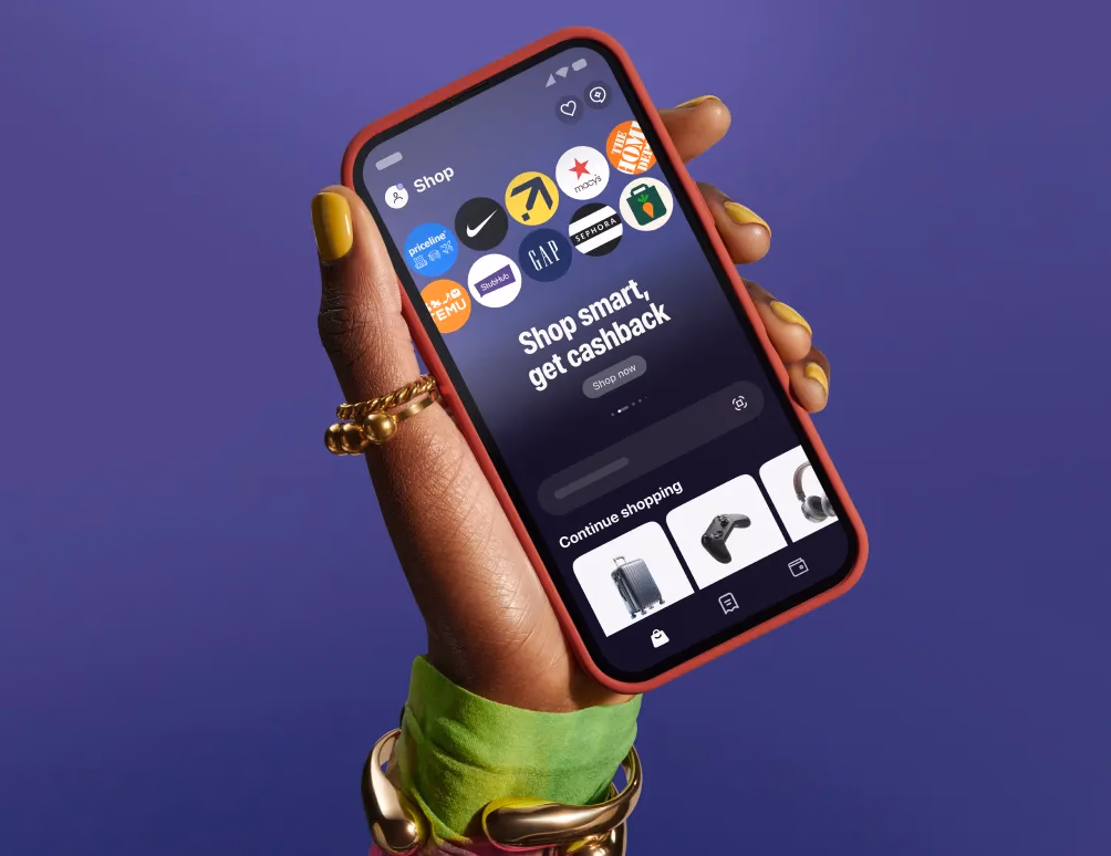
Cashback status lived in the existing smart shopping panel — no new nav icon, no new chrome added to the browser.
Users didn't understand cashback — or where to find it
Post-launch, three problems surfaced:
- Users didn't know any payment method qualified for cashback — they assumed it was card-specific.
- The splash disappeared too fast for slower readers to register the rate.
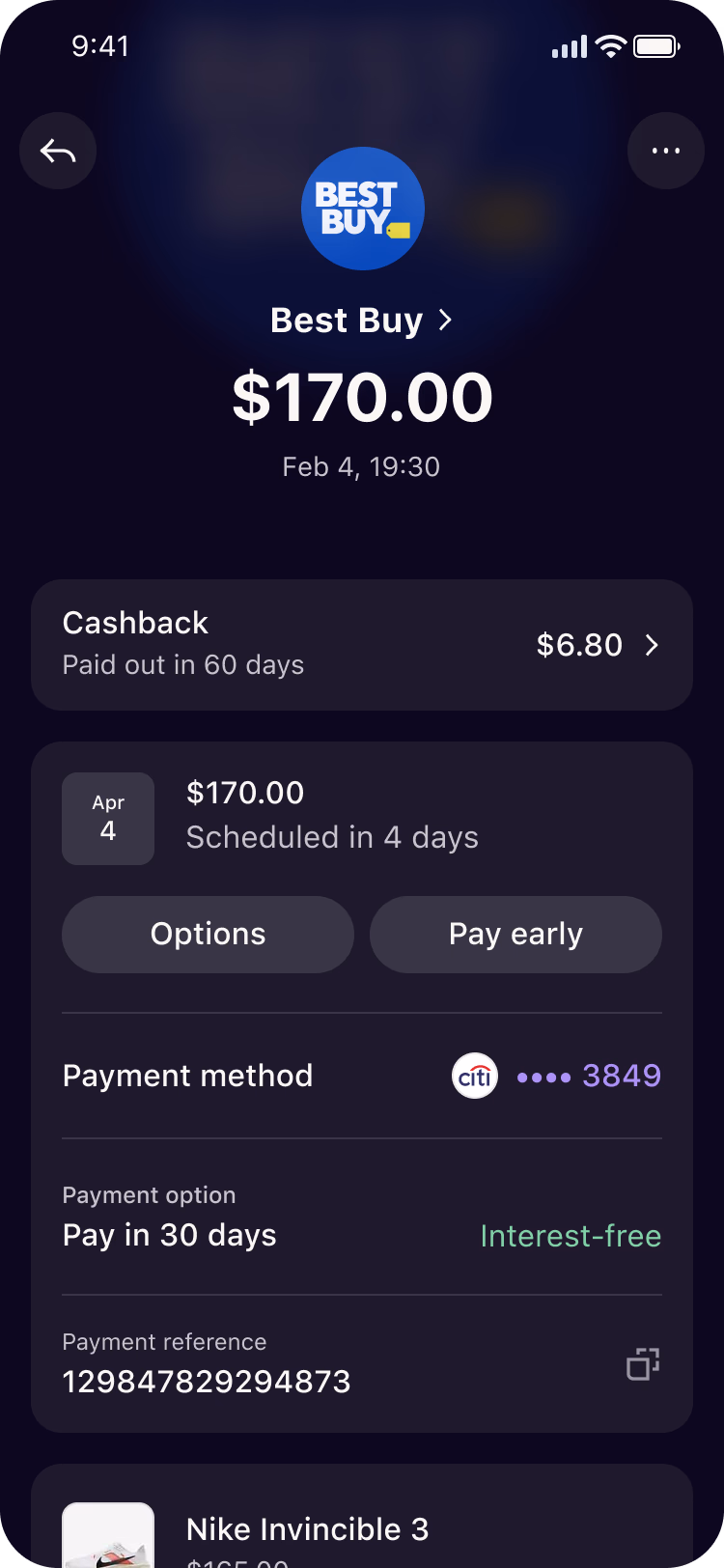
- After the splash closed, users couldn't find their cashback status anywhere.
The iteration scope expanded to cover all three — plus auto cookie acceptance to remove one more point of friction.
Three problems. Three solutions.
A redesigned splash with extended display time, a skip CTA, and a link to more information. A dedicated cashback sheet for persistent access. A browser onboarding flow for first-time users.
+$140M CPA revenue. OTC metrics: untouched.
The target was $77M annual CPA revenue uplift. We hit $140M — 82% over target. Shopping MAU hit 300K. Monthly app purchases reached 874K against a 770K target. OTC creation and conversion did not drop.
The learning: when introducing a new behaviour into an existing journey, the existing journey's metrics are the guardrail. Optimise for the new thing only after you've proven you haven't broken the old one.