Reframing Delivery as a Confidence Problem
The back-and-forth in H&M's checkout wasn't confusion. Users knew where to click — they just weren't sure they'd picked the right delivery option.
I tested three concepts. The one that performed best was too expensive to build as-is. A simpler version — all delivery options flat in one list — was almost as good and easy to build. We shipped that.
The win was not a prettier checkout. It was one confident decision.


Users were going back and forth — but nobody knew why
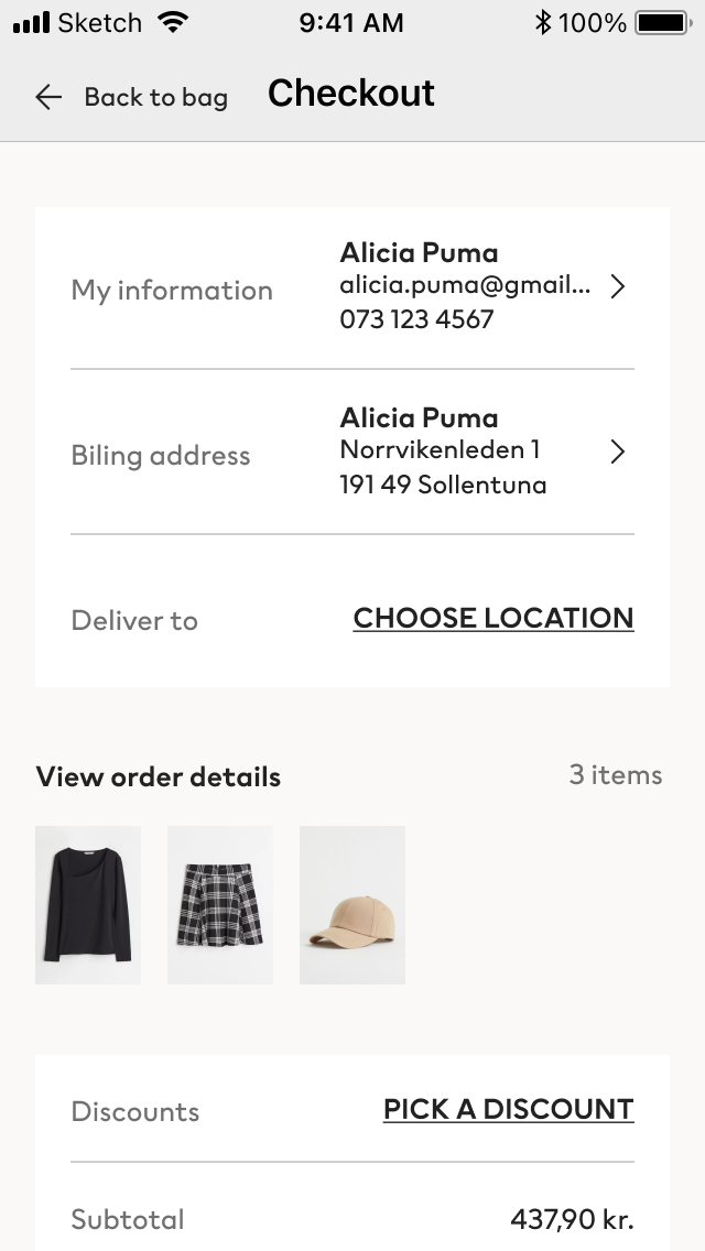
H&M had just shipped a checkout redesign when I joined. Analytics immediately flagged something odd in the delivery section: users selecting an option, going back, selecting again. I pulled session recordings to see it firsthand. Hesitation, not confusion — they knew where to click, they just weren't sure they were right.
Users were not lost. They were uncertain.
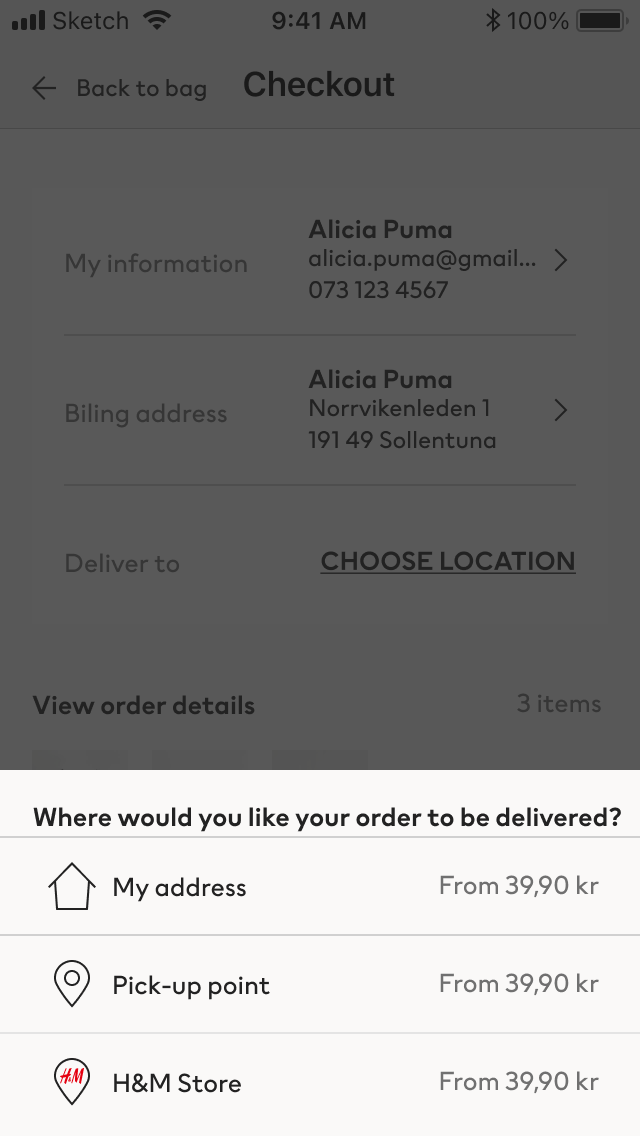
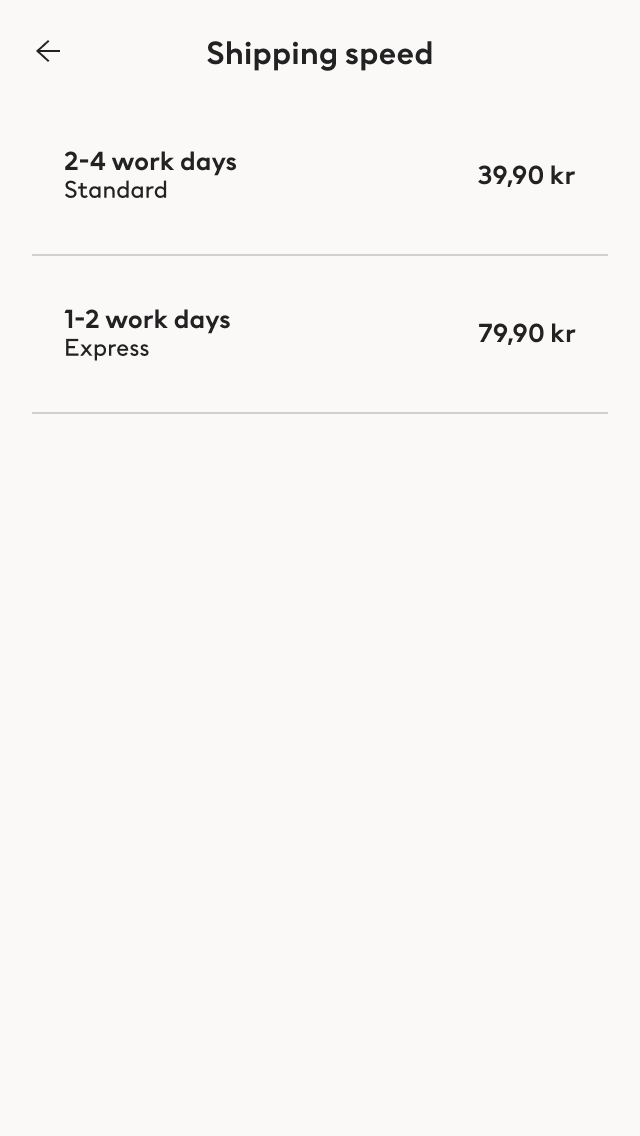
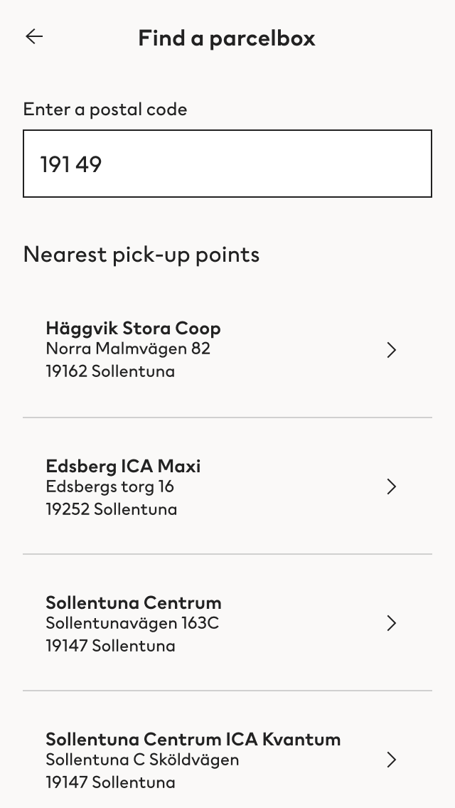
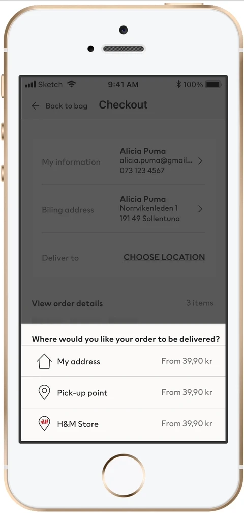
- Root causeChoose before you can compare.The flow asked for a delivery method before revealing prices, speeds, or which options were sustainable or included a parcel box.
- CascadeNo way to compare.There was no way to weigh options across any dimension — cost, speed, sustainability, or whether a parcel box was even available.
- User signalBack to method selection. Again.People trying to piece together information the interface split across screens.
Three concepts, each betting on a different confidence signal
Competitor analysis across major European retailers. Ideation workshop with the team. Three concepts, three different bets on what creates confidence at the point of delivery selection.
8 participants per concept. 32 tests total. Tasks: find the cheapest, fastest, and most sustainable option — and whether a parcel box was available. Participants rated perceived ease after each task.
Concept A — Parcel box entry point
Surface the most-selected method upfront. Social proof as a confidence signal — if most people chose this, it's probably right.
Concept B — Desired outcome
Choose by goal: quickest, cheapest, most sustainable. Natural framing over logistics jargon — pick what matters, not what it's called.
Concept C — One screen
All options visible at once, pre-selected to the most likely choice. Comparison beats sequential selection — see everything, decide once.

Concept C won. Engineering pushed back.
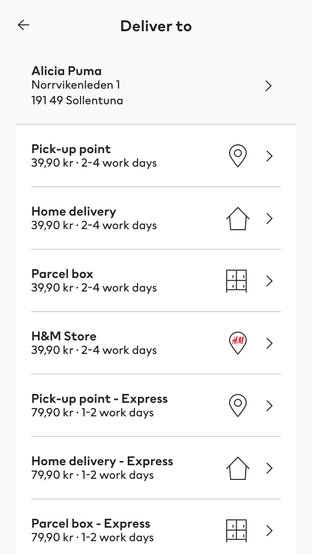
Concept C performed best but required the most engineering effort. I took two simpler variants back into testing. Simplification C1 — all options in one list — came close on every confidence metric and was the easiest to build. So we shipped it.
Perceived ease of finding each delivery option (1–7)


All options. One list.
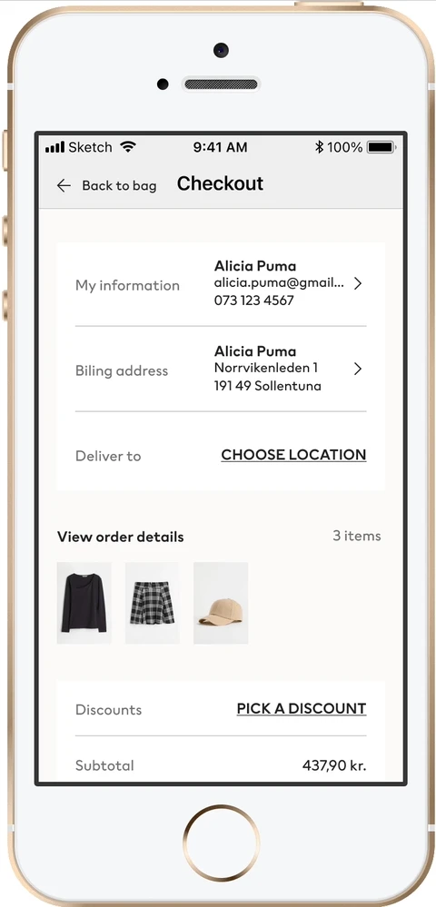
All delivery types in a single list, speed variants expressed inline — no wizard flow, no hidden options. Users could see everything and make one confident decision.
46% faster. +0.32% CVR. $20M+ estimated annual upside.

